wikimove SaaS Dashboard

Time Span
January 1, 2023
April 30, 2025
Client
wikimove
Project Type
UX/UI
My Role
UX/UI Designer
Tools
Figma
Figjam
Lyssna
Notion
Manuel Krueger
Professional B2B dashboard UI design for wikimove fleet management system featuring dark mode interface with real-time data visualization, provider performance charts, zone occupation indicators, and multi-jurisdiction selector

Project Background

Problem Statement

Cities managing shared mobility services face the challenge of coordinating multiple mobility providers, monitoring hundreds of vehicles in real-time, and responding to operational issues across dispersed zones. For public transport associations overseeing multiple municipalities, this complexity multiplies—requiring constant context-switching between jurisdictions, each with unique providers, zones, and operational data. Existing solutions lacked unified interfaces for multi-jurisdiction oversight whilst maintaining data clarity and operational efficiency. The challenge was designing a comprehensive SaaS dashboard that consolidates critical operational data into a single view and enables effortless jurisdiction switching without losing context or requiring separate logins.efficiency. The challenge was designing a comprehensive SaaS dashboard that not only consolidates critical operational data into a single view, but also enables effortless switching between jurisdictions without losing context or requiring separate logins.

Project Goals

The primary objective was designing a unified SaaS dashboard enabling city operators and public transport associations to efficiently monitor, analyse, and manage shared mobility operations across multiple providers, zones, and jurisdictions. The solution needed to consolidate real-time fleet status, trip analytics, and provider performance into a single interface whilst enabling rapid issue identification through visual indicators and prioritised support tickets. Critical requirements included seamless jurisdiction switching for associations managing multiple municipalities, intuitive data visualisation supporting quick decisions without extensive training, strict MUI design system v7.2.0 adherence for consistency and accessibility, and a scalable widget architecture accommodating future expansion—all whilst optimising information density and maintaining visual clarity across responsive breakpoints.

Background Context

In 2024, German cities increasingly adopted shared mobility infrastructure as part of sustainable transport strategies, requiring sophisticated management tools to coordinate multiple operators whilst ensuring regulatory compliance and service quality. Lichtenau, implementing comprehensive mobility-as-a-service infrastructure, needed a professional dashboard to oversee providers (STWL, ZEUS, Donkey Republic) and optimise zone occupancy. The challenge extended beyond single-city management—public transport associations coordinating regional networks across multiple jurisdictions required unified platforms enabling seamless oversight without fragmented tools or repeated logins. Existing solutions lacked the multi-tenant architecture and intuitive interface necessary for efficient regional coordination. The wikimove Mobility Manager App was developed to address these gaps, providing operators and transport associations with a scalable SaaS dashboard handling complex, multi-jurisdiction operations whilst maintaining clarity and actionable insights for 999+ vehicles.

The Process

Research

To design an effective mobility management dashboard, I analysed the wikimove Mobility Manager platform capabilities, reviewed operator workflows through the user handbook, and conducted competitive analysis of existing mobility dashboards.

Platform & Competitive Analysis:

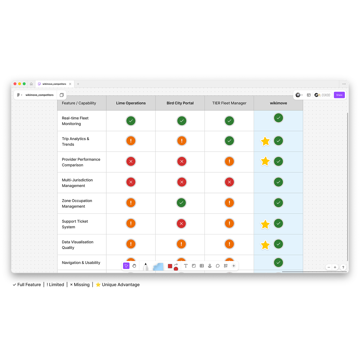
Examination of the wikimove Mobility Manager platform revealed comprehensive data capabilities (fleet monitoring, trip analytics, provider management, zone coordination) whilst identifying critical gaps in data presentation and multi-jurisdiction navigation. Analysis of competitor solutions (Lime Operations Dashboard, Bird City Portal, TIER Fleet Manager) revealed key shortcomings:

  • Real-time maps prioritised over aggregated analytics, forcing constant view-switching
  • No seamless multi-jurisdiction switching—separate logins caused context loss for regional associations
  • Cluttered interfaces with information overload hindered quick decision-making
  • Provider comparison tools were absent or buried in complex reporting

Key Insights & Design Implications:

Research identified critical operator needs that directly informed dashboard design decisions. At-a-glance status requirements drove the persistent KPI bar, comparison data needs informed week-over-week trends and provider rankings, and visual hierarchy requirements led to colour-coded indicators (green/orange/red) for instant issue identification. Two insights shaped core features: associations managing 3-5 municipalities needed instant jurisdiction switching validating the prominent selector placement, and operators struggling with cluttered interfaces validated the widget-based modular architecture.

Competitive analysis matrix comparing mobility management dashboards - wikimove vs Lime Operations, Bird City Portal, and TIER Fleet Manager showing unique advantages in multi-jurisdiction management and data visualisation quality

Design

Based on research insights, I developed a widget-based dashboard architecture using Material-UI design system v7.2.0, ensuring consistency, accessibility, and efficient developer handoff whilst balancing information density with visual clarity.

Design System & Architecture:

A widget-based dashboard was developed using Material-UI v7.2.0, implementing the wikimove brand palette (lightBlue/700 #0288D1 primary, success #2e7d32, warning #ed6c02, anthracite/900 #2D3142 neutrals) as design tokens for visual consistency. A 12-column responsive grid enabled flexible widget sizing in three widths—3 columns (compact stats), 6 columns (medium charts), 9 columns (detailed visualisations)—with critical metrics (fleet availability, active trips, revenue, NPS) positioned in a persistent top bar and secondary analytics in the scrollable dashboard area below. Comprehensive component specifications documented exact MUI usage (CardHeader, CardContent, Typography variants), colour tokens, spacing (16px padding/gaps), and elevation hierarchy, ensuring seamless developer handoff.

Widget Design & Iterative Refinement:

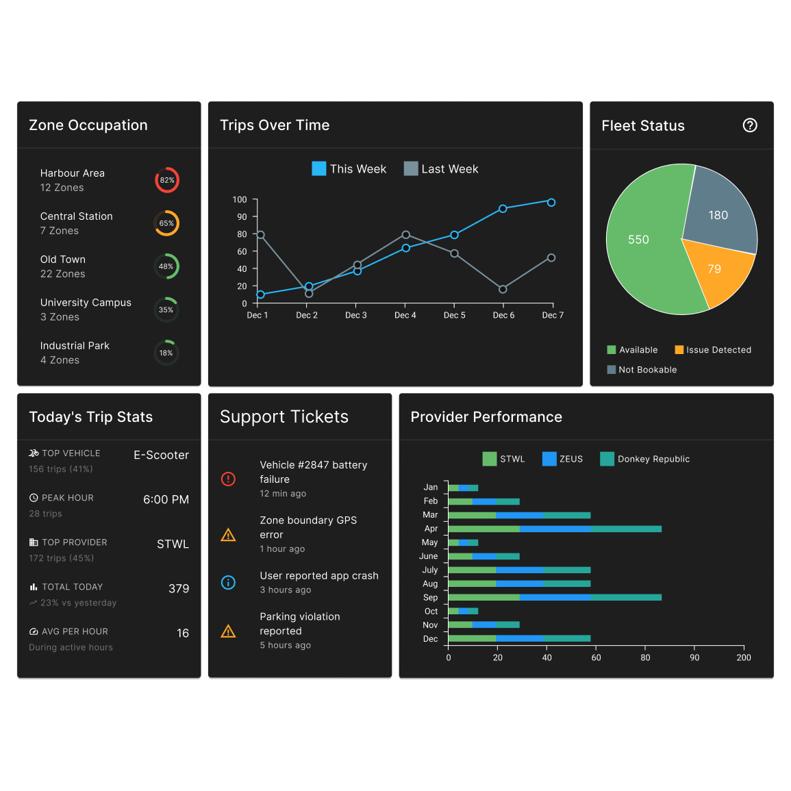
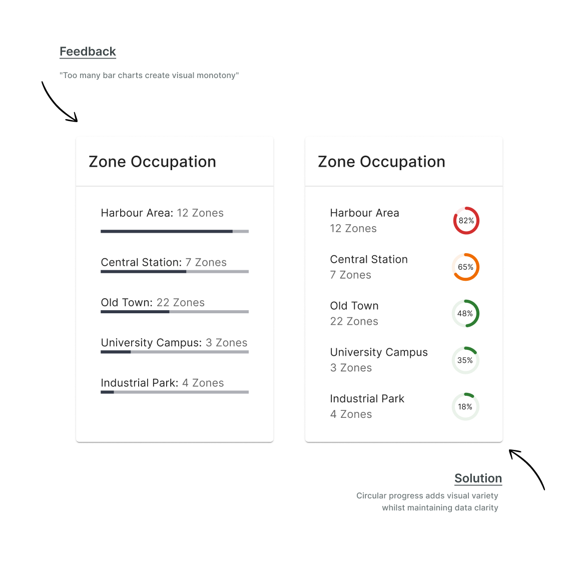
Eight distinct widget types addressed specific operator needs: KPI tiles with colour-coded trend indicators, line charts for week-over-week trip comparison, stacked bars for provider performance (STWL green, ZEUS blue, Donkey teal), and circular progress for zone occupation. Multiple iterations refined visual variety—shifting zone occupation from linear to circular progress based on feedback about bar chart repetition—and calibrated typography hierarchy (24px bold values, 11px semibold uppercase labels, 12px regular details) for scannability at multiple reading depths. Colour-coded severity levels (green <40%, orange 40-70%, red >70%) enabled instant issue identification without reading numerical values.

SaaS dashboard widget showcase for wikimove mobility manager featuring dark mode UI with zone occupation circular progress, trip analytics line chart, fleet status pie chart, support tickets, provider performance bars, and real-time KPI metrics

Testing & Validation

Design System & Accessibility Validation:

All components were validated against MUI v7.2.0 specifications and WCAG 2.1 AA standards, verifying typography hierarchy, colour contrast ratios, touch target sizing (minimum 48×48px), and colour-blind accessible palettes for status indicators. The dashboard was evaluated against Nielsen's usability heuristics, confirming strong performance in consistency, visibility of system status, and aesthetic minimalism whilst identifying opportunities to strengthen visual feedback through colour-coded zone occupation levels and persistent KPI accessibility.

Stakeholder Review & Iterative Refinement:

Interactive Figma prototypes were reviewed with stakeholders, gathering feedback on information hierarchy and data visualisation clarity. Key improvements included shifting zone occupation from linear bars to circular progress indicators (reducing visual monotony), refining typography hierarchy (24px bold KPIs, 11px semibold labels, 12px regular supporting text), implementing green/orange/red severity indicators for instant issue identification, and elevating critical metrics to a persistent top bar ensuring operators maintain visibility of fleet availability, active trips, revenue, and NPS regardless of scroll position.

Before and after UI design iteration showing zone occupation widget transformation from linear progress bars to circular indicators based on stakeholder feedback for wikimove mobility dashboard reducing visual monotony

Solution

Multi-Jurisdiction Architecture

The wikimove Mobility Manager dashboard addresses the critical challenge of regional oversight through a seamless multi-jurisdiction architecture. A prominent jurisdiction selector in the bottom-left navigation enables public transport associations to switch between municipalities (e.g., Lichtenau, Paderborn, Gütersloh) with a single click, with all dashboard widgets—fleet status, trip analytics, provider performance, and zone occupation—instantly updating to reflect the selected jurisdiction's data. This eliminates context-switching friction, removes the need for multiple logins or separate dashboards, and enables efficient regional coordination for associations managing 3-5+ municipalities from a unified interface.

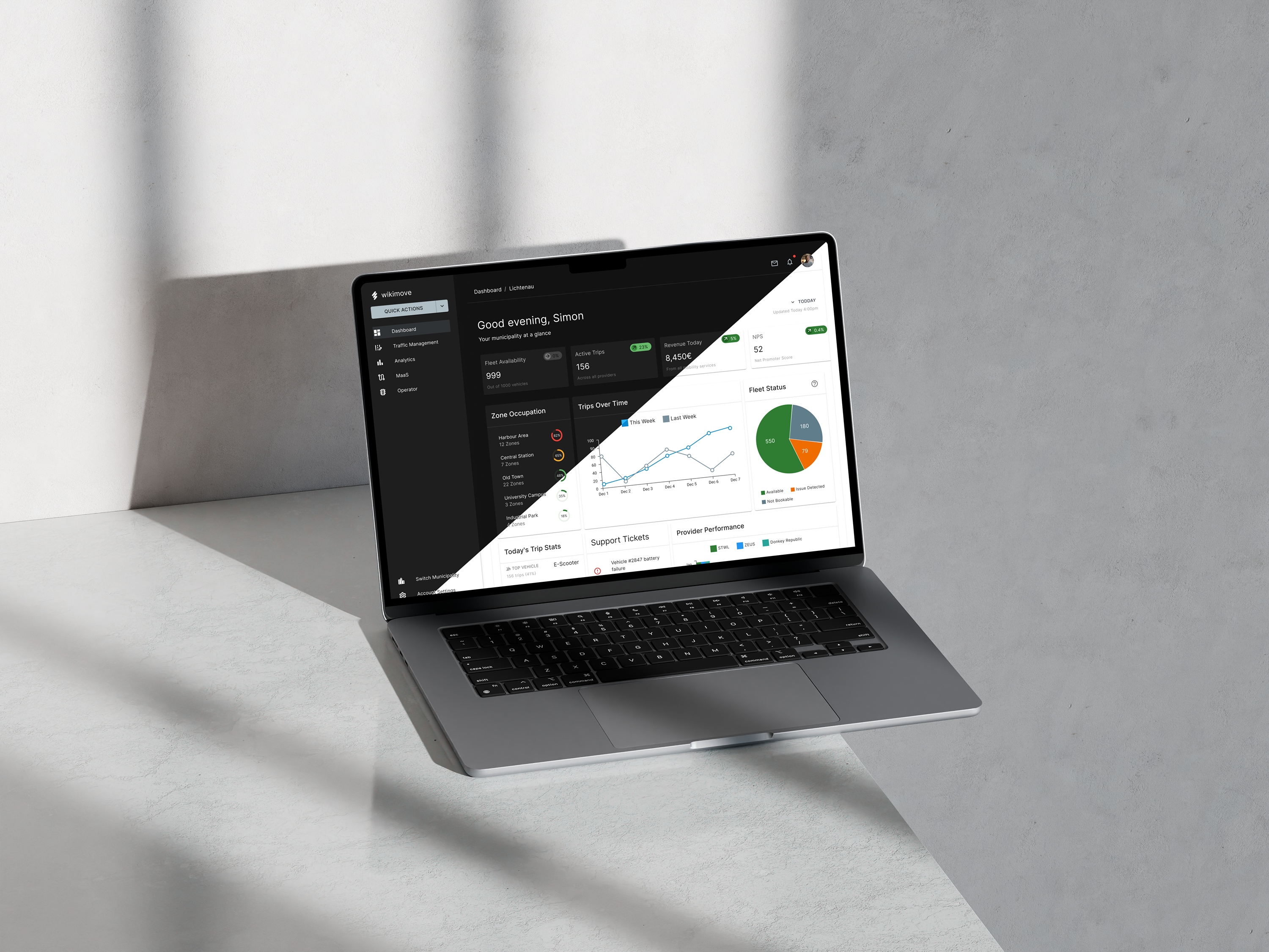
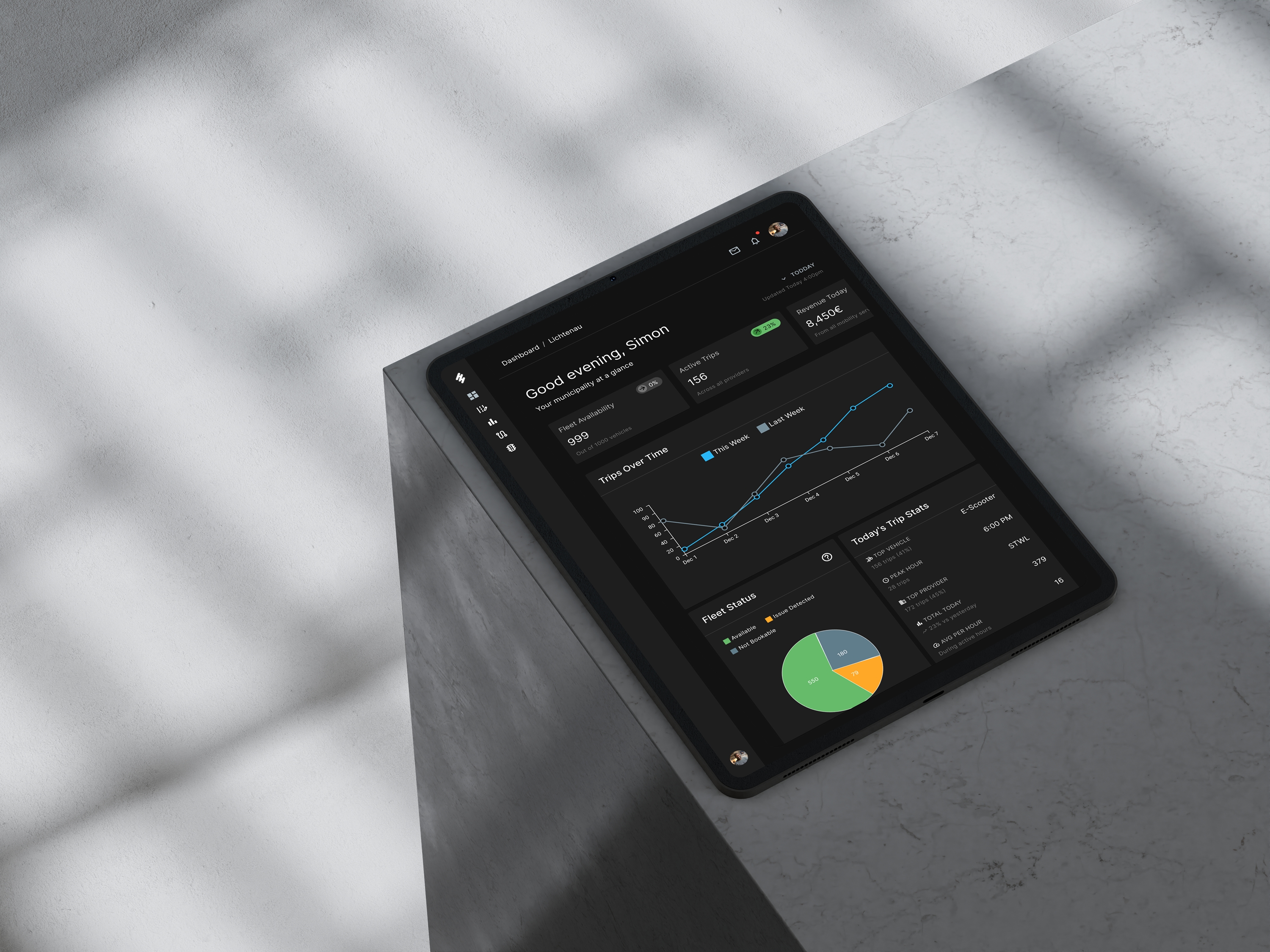
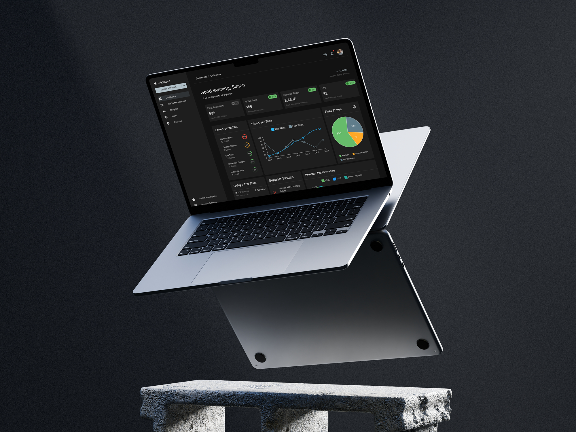
Widget-Based Operational Dashboard

Eight specialised widgets address specific operator needs whilst maintaining visual clarity through a 12-column responsive grid. A persistent KPI bar provides at-a-glance access to critical metrics (fleet availability 68%, active trips 127, revenue €12.5K, NPS 52) without scrolling, whilst the scrollable dashboard area presents detailed analytics: fleet status pie chart for immediate vehicle availability assessment, week-over-week trip comparison line chart for trend identification, provider performance stacked bars (STWL, ZEUS, Donkey Republic) for service quality oversight, colour-coded zone occupation indicators (green/orange/red) for instant capacity assessment, and prioritised support tickets for operational issue management. The MUI-based design system ensures consistency, accessibility (WCAG 2.1 AA), and efficient developer handoff through documented component specifications.

Custom SaaS dashboard design for wikimove mobility manager on MacBook Pro displaying MUI-based interface with navigation sidebar, KPI metrics, trip analytics, and fleet monitoring widgets in responsive layout
wikimove mobility dashboard SaaS interface on iPad Pro showing dark mode design with real-time fleet status pie chart, trip analytics line graph, and data visualization widgets for multi-jurisdiction fleet management
No items found.

Final Thoughts

The wikimove Mobility Manager dashboard successfully addressed the core challenge of multi-jurisdiction mobility management, delivering a comprehensive SaaS interface that enables city operators and public transport associations to efficiently oversee shared mobility operations across multiple municipalities. The widget-based architecture, built on Material-UI v7.2.0, provides operators with immediate access to critical metrics through a persistent KPI bar whilst detailed analytics widgets enable deep operational insights—from fleet availability and trip patterns to provider performance and zone capacity. The seamless jurisdiction switching capability eliminates the context-switching friction that previously hindered regional associations, positioning the solution as a scalable, enterprise-ready mobility management platform. Deliverables included a complete high-fidelity Figma prototype with comprehensive component specifications, documented design system implementation (colour tokens, typography hierarchy, spacing system), and developer handoff documentation ensuring seamless translation from design to production. The design system's adherence to WCAG 2.1 AA accessibility standards and responsive grid architecture supports both current operational needs and future feature expansion, whilst the multi-jurisdiction architecture provides a significant competitive differentiator in the mobility management space. The project successfully balanced information density with visual clarity, creating an intuitive interface that empowers operators to make informed decisions quickly without extensive training.

Interested in this project or launching your own product?

Work With Us
Work With Us
More ways to connect: