19 User Experience Psychology Laws Every Designer Should Know
User experience psychology encompasses 19 core principles that explain human behaviour in digital interfaces. These laws include Fitts' Law (target size and distance), Hick's Law (decision complexity), Miller's Law (memory limits), and Gestalt principles (visual grouping). Apply them to reduce cognitive load, improve usability, and create interfaces that feel natural. The most impactful principles address decision-making speed, visual hierarchy, and memory constraints.
The Foundation: Understanding UX and Psychology
Psychology in UX design bridges the gap between human cognition and interface functionality. These principles answer fundamental questions: How many types of UX laws are there? What are the UX laws that come under heuristic evaluation? The 19 principles fall into several categories: perception and visual grouping, decision-making and cognitive load, memory and information processing, and interaction mechanics.
Each principle emerged from empirical research, often decades before digital interfaces existed. Their continued relevance proves they address fundamental human traits rather than temporary design trends.
Laws Governing Visual Perception
1. Aesthetic Usability Effect
Users perceive visually appealing designs as more usable, regardless of actual functionality. Research by Misaki Kurosu and Kaori Kashimura in 1995 tested 26 ATM interface variations. They found stronger correlation between aesthetic appeal and perceived ease of use than between appeal and actual usability. This principle doesn't excuse poor functionality, but it does highlight how visual design creates first impressions that influence the entire user experience.

2. Law of Proximity
The proximity psychology definition centres on spatial relationships. Objects positioned near each other are perceived as related groups. This Gestalt principle helps users quickly distinguish content clusters without reading every word. In practice, group related form fields together, separate distinct sections with white space, and position labels close to their corresponding inputs.
3. Law of Similarity
The similarity psychology definition states that elements sharing visual characteristics (colour, shape, size, or orientation) are perceived as belonging together. Navigation links styled consistently signal their shared function. Primary action buttons sharing the same colour help users identify equivalent importance across different screens.
4. Law of Common Region
Elements within a defined boundary are perceived as groups, even if separated by space. Cards, boxes, and panels create visual containers that organise information. This principle strengthens when combined with proximity and similarity, creating clear information architecture that users grasp immediately.
Decision-Making and Cognitive Load
5. Hick's Law
Decision time increases with the number and complexity of choices. William Edmund Hick and Ray Hyman's 1952 research quantified this relationship. Break complex tasks into smaller steps. Reduce menu options. Progressive disclosure reveals advanced features only when needed. E-commerce sites applying Hick's Law reduce cart abandonment by simplifying checkout into clear, sequential steps rather than overwhelming users with a single form containing 20 fields.
6. Miller's Law
Working memory holds seven items, plus or minus two. George Miller's 1956 research identified this cognitive limit. Organise content into groups of five to nine items. Phone numbers use chunking (020-1234-5678) because remembering 11 digits exceeds working memory. Navigation menus exceeding nine options cause confusion. Pagination, categorisation, and search functions help users manage information that exceeds memory capacity.
7. Jacob's Law
Users spend most time on other interfaces, so they prefer yours to work similarly. Jakob Nielsen emphasised leveraging familiar patterns rather than forcing users to learn new conventions. Shopping cart icons, hamburger menus, and swipe gestures succeed because users recognise them from countless other applications. Innovation should enhance familiar patterns, not replace them without compelling reason.
Interaction Mechanics
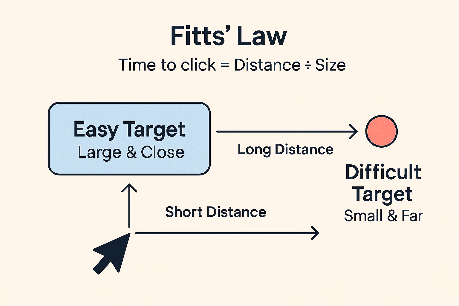
8. Fitts' Law
Paul Fitts demonstrated in 1954 that target acquisition time depends on distance and size. Large buttons positioned close to users' current focus are faster to click. Small targets far from the cursor slow interaction and increase errors. Mobile interfaces apply this by placing primary actions within thumb reach. Dropdown menus fail Fitts' Law because small hover targets create frustration.
9. Doherty Threshold
Productivity soars when computer response times stay under 400 milliseconds. Walter Doherty and R. Vicente Donni's 1982 research set this benchmark. Loading indicators, optimistic UI updates, and perceived performance techniques keep users engaged even when actual processing takes longer. Applications exceeding the Doherty Threshold feel responsive and encourage continued interaction.
Memory and Information Processing
10. Serial Position Effect
Users remember first and last items in lists whilst middle items fade. Hermann Ebbinghaus identified this through memory research combining primacy and recency effects. Place important information at list beginnings or endings. Navigation menus position critical links first. Forms end with submit buttons users definitely notice.
11. Zeigarnik Effect
People remember incomplete tasks better than completed ones. Bluma Zeigarnik's research explains why progress bars, partially completed profiles, and multi-step processes create engagement. Users feel compelled to finish what they started. Onboarding flows leverage this by showing completion percentages that motivate users to continue.
Simplicity and Efficiency
12. Law of Prägnanz
People interpret ambiguous images in their simplest form because brains prefer minimal cognitive effort. Max Wertheimer's observations from 1910 established this Gestalt principle. Icons should communicate meaning at a glance. Reduce visual complexity. Users appreciate clean interfaces that don't force interpretation.
13. Occam's Razor
Among competing solutions, choose the simplest. This problem-solving principle applies directly to interface design. Additional features create maintenance burden and learning curves. Simplicity doesn't mean removing useful functionality. It means eliminating unnecessary complexity that obscures core value.
14. Tesler's Law
Every system contains irreducible complexity that cannot be eliminated, only moved. Larry Tesler argued engineers should absorb complexity rather than forcing users to manage it. Smart defaults, progressive disclosure, and automation shift burden from users to systems. Confirmation bias UX examples show how designers sometimes add unnecessary confirmation dialogs, creating friction rather than safety.
Emphasis and Attention
15. Von Restorff Effect
Distinctive items are remembered better than similar ones. Hedwig von Restorff's research explains why call-to-action buttons use contrasting colours. However, overusing emphasis diminishes its effectiveness. If everything screams for attention, nothing stands out. Reserve distinctiveness for genuinely important elements.
16. Pareto Principle
Eighty per cent of effects come from 20 per cent of causes. Focus design effort on features serving most users rather than edge cases. Analytics reveal which 20 per cent of functionality delivers 80 per cent of value. This doesn't mean ignoring accessibility or uncommon scenarios, but it does guide resource allocation.
Additional Guiding Principles
17. Postel's Law
Be liberal in what you accept, conservative in what you send. Jon Postel's robustness principle guides error handling. Accept varied input formats (phone numbers with or without spaces). Provide clear feedback. Forms applying this principle forgive human imperfection rather than punishing minor formatting mistakes.
18. Parkinson's Law
Tasks expand to fill available time. This humorous observation has serious implications for deadline-driven design sprints and user task completion. Constrained timeframes often produce focused results, whilst unlimited time encourages scope creep.
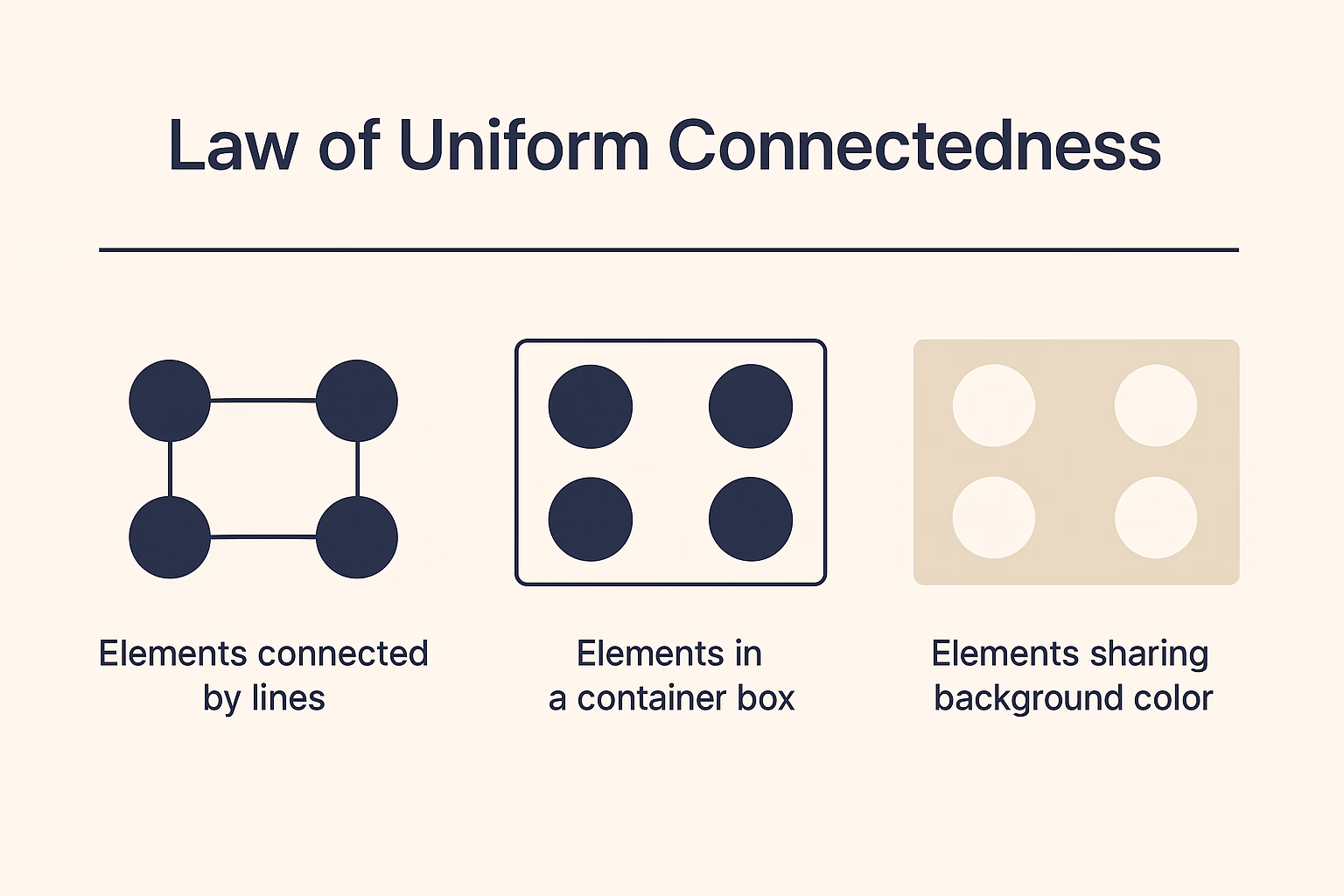
19. Law of Uniform Connectedness
Elements visually connected through colour, lines, or containers are perceived as more related than disconnected elements. This principle strengthens when combined with proximity and common region, creating robust information hierarchy that guides attention naturally.
Applying Psychology Principles Systematically
Heuristics UX evaluation incorporates many of these principles. Nielsen's 10 usability heuristics overlap substantially with psychological laws. Recognition rather than recall aligns with Miller's Law. Consistency and standards reflect Jacob's Law. Aesthetic and minimalist design embodies Prägnanz and Occam's Razor.
These principles work together rather than in isolation. Proximity groups related elements. Similarity reinforces those relationships. Common region contains them. The combined effect creates clear visual hierarchy that reduces cognitive load, enabling users to focus on tasks rather than interface interpretation.
Conclusion
User experience psychology provides evidence-based foundations for design decisions. These 19 laws transform interfaces from subjective preferences into systems aligned with human cognition. Start by applying Fitts' Law to interactive elements, use Hick's Law to simplify decision points, and leverage Gestalt principles for visual organisation. The most effective interfaces combine multiple principles, creating experiences that feel intuitive because they match how people naturally process information. Which principle will you implement first in your next project?
Ready to transform user frustration into intuitive experiences? Schedule a free consultation to apply these principles to your product.


